Nonprofit Technology & Fundraising Blog
Subscribe to our mailing list
January 11, 2018 |

Ten months ago, DP Community changed the way you interact with DonorPerfect. It became the place for you to connect with other nonprofits, review your case history, get answers to your questions and learn new features. In response, your feedback has been incredibly supportive and positive! In fact, clients like you have been able to help drive our success using the tools we have in DP Community.
The release of DP Community was just the beginning of evolving the site as a useful resource for you. Since last March, we have consistently made incremental changes to improve DP Community, many in ways you might not notice at a glance. We’ve improved the search results, added information to your account profile, and created additional content, like the new DPMobile iOS and Android series.
One of the main focuses of DP Community is to provide you with useful and timely information. We’re always adding new articles and other content to help you navigate through the tasks of running your nonprofit. The next DP Community release, scheduled for Monday, January 15th, makes it easier to find that content. It puts everything you need right at your fingertips!
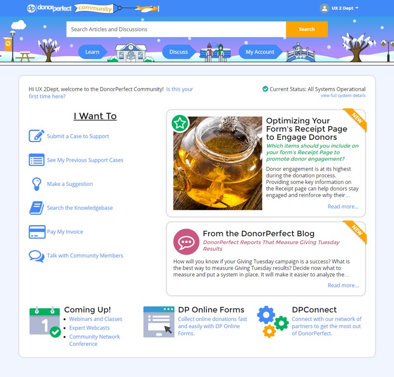
You might be familiar with the middle section of the DP Community home page (shown below). Our statistics told us that you weren’t using this section to its full potential. So we set out to make it more effective. Our goal was to put important and timely information in front of you where it is easily discoverable.
First, “Quick Tips” is being retired since it wasn’t being utilized at all. This allows us to make the “Feature Story” larger, and give it a much more prominent placement on the page. Likewise, the “Blog” section has been expanded, and now features more information about the post so you can quickly know if the article applies to you.
The other significant adjustment you’ll notice is in the “I Want To” menu. It has shifted to a horizontal section on the left side of the page. This layout change accommodates the expanded “Feature Story” and “Blog” sections and leaves us room to include other items in the menu in the future.
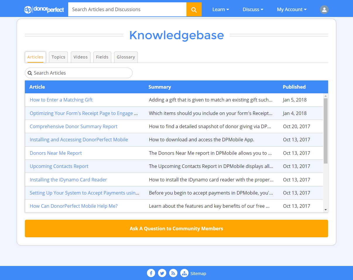
Since DP Community is an extension of DonorPerfect, we made changes to the overall styling to be more consistent with DonorPerfect itself. We’ve also set up some fun seasonal themes in the header that will change automatically throughout the year. Finally, we’ve decreased the overall height of the header when you scroll down the page. This provides more room for content to display and makes it easier to navigate.
How do you like the new changes? Do you have other ideas for how we can improve DP Community? Visit Suggest and Vote to let us know!
Follow us on social!