Nonprofit Technology & Fundraising Blog
Subscribe to our mailing list

November 16, 2022 | Donor Acquisition, Online Fundraising
An estimated 15% of the world’s population lives with a disability, and your nonprofit’s donation form can be viewed from anywhere in the world. Accessibility compliance means doing the right thing for your donors, volunteers, and nonprofit website visitors. This integrity brings you closer to those you serve, avoids legal action for your organization, and eliminates obstacles to understanding your mission. Not to mention, the use of website accessibility solutions can garner greater online fundraising revenue, according to UserWay.

When your donation form is inaccessible, it sends a message to people with disabilities that they don’t have equal access to your online fundraising and therefore may be excluded from participating in your mission. As the U.S. Department of Justice puts it, an inaccessible page can exclude people just as much as steps at an entrance to a physical location.
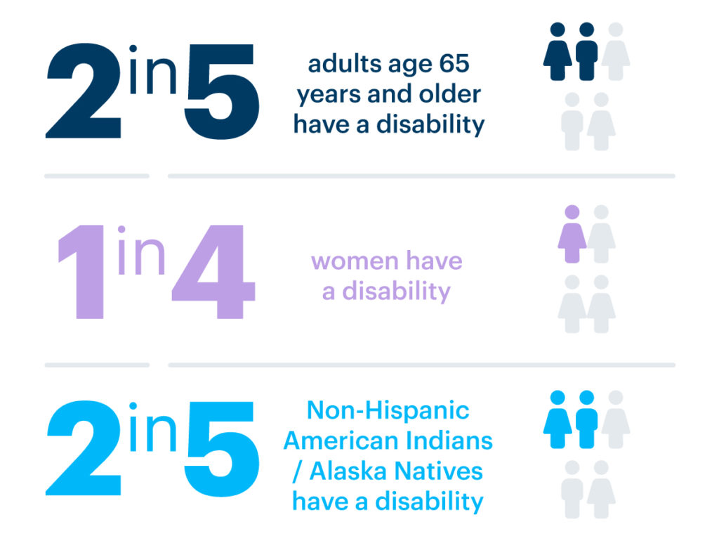
Think about the people in your constituency and anyone else who could potentially use your donation form (or other online forms). Do you work with women, adults 65 or older, or people living in poverty? Socioeconomic factors such as income, education, employment, community safety, and social support affect a person’s ability to treat disabling conditions and mitigate their impact. In fact, the National Disability Institute finds that disability causes poverty, poverty causes disability, and race is linked to both.
In the nonprofit community, there can be unique challenges to addressing donation form accessibility. Most fundraisers don’t have the time, staff resources, or infrastructure to make hand-coded updates to their organization’s website. That’s a time-consuming, expensive process that leaves room for error.
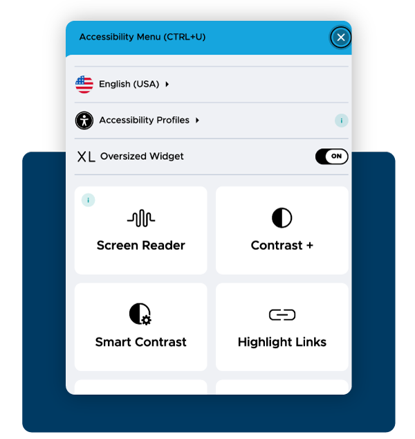
Fortunately, there are affordable options that comply with the Web Content Accessibility Guidelines and don’t require a background in computers. For example, nonprofits who use DonorPerfect Online Forms can provide their constituents with a user-triggered accessibility widget called UserWay, a leading solution trusted by more than 1 million websites. Established organizations like the United Way, Special Olympics, and Amnesty International offer this tool to their donors and volunteers.
DonorPerfect Online Forms are WCAG 2.1 AA compliant, including a full suite of 100+ AI-powered accessibility functions, e.g. screen reader, dictionary, text size, saturation, contrast, dyslexia-friendly font, and more.
See a sample DonorPerfect Online Form with the UserWay accessibility widget >>

Brand recognition makes people more inclined to trust the page they’re visiting and the widget they’re using, thus naturally increasing their likelihood to use it again. While making their donations, donors want to make sure they are not being taken to another website against their will or being conned by clickbait. The more familiar your donation form looks and feels, the easier it is to navigate.
In the nonprofit industry, specifically, visitors want to feel confident that the donation form in question is a safe place to contribute funds to their intended cause. To show that your accessibility solution is safe and easy to use, consider matching it to the look and feel of your website. To match their nonprofit’s branding, organizations using DonorPerfect Online Forms can customize the color, icon, and placement of their accessibility widget, as well as the button and background colors on their form.
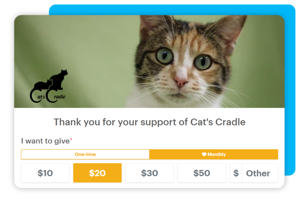
“The main reason that we enjoy our DonorPerfect Online Form so much is its user-friendliness. I love that you can set gift amounts and they’re easy to see and select. We wanted our donors to feel secure in making a gift – not as if they got to the wrong site. They know they’re in the right place as soon as they scan the QR code on all of our appeals.”
Sherri H., Marketing and Communications Director, Cat’s Cradle

The principles of accessibility are often explained using the acronym POUR: Perceivable, Operable, Understandable, and Robust.
People perceive the world around them using their five senses. Right now, accessibility resources online and in tech revolve around seeing, hearing, and touching. For example, the UserWay accessibility widget offers a screen reader, dictionary, bigger text, saturation, contrast, dyslexia-friendly fonts, and more. In the future, new technologies could allow users to interface via smell and taste.
Your website navigation, buttons, and other interactive elements allow users to control your interface, visually identifying elements to swipe or click. Some users may need to utilize voice commands or a keyboard. As mentioned, UserWay allows nonprofits to change button color and placement, and users can change the cursor size and highlight links.
Understanding comes with the consistency of your website’s format and presentation, or in other words, making its designs and patterns predictable, reliable, and easy to navigate. When your nonprofit website content is comprehensible to your users, they will find the information more accessible and available to them.
Is your website designed to function on all relevant technologies, like mobile and tablet devices? Does it allow your nonprofit to fully comply with all accessibility requirements and standards? Can users choose how they want to interact with your content? With a robust website and accessibility solution, nonprofits can answer “yes” to all of the above.
We hope that these tips have helped you consider how to make these changes without the headache of hand-coding or overhauling your entire site. Remember, you’ll be doing the right thing for your constituency, serving your community with dignity, and hopefully funneling more revenue into your mission.
We recommend speaking to your online forms provider or website developer to determine the next steps in making your donation form accessible. Please let us know in the comments if you have any questions.
Follow us on social!